library(tidyverse)
library(tidymodels)
library(knitr)
library(ggfortify)Lab 3 - Coffee ratings
Introduction
In today’s lab you will analyze data from over 1,000 different coffees to explore the relationship between a coffee’s aroma and it’s overall quality.
This lab also provide you an instruction for how to collaborate with others using a Github repo. It provides you some suggestions on work on the same project in order. It suggests only one person type in the .qmd file, commit, and push updates at a time. Your team can choose to follow this workflow.
If you plan to try this workflow,
- assign each person on your team a number 1 through 4.
- follow the guidance
Packages
The following packages are used in the lab.
Data: Coffee ratings
The dataset for this lab comes from the Coffee Quality Database and was obtained from the #TidyTuesday GitHub repo. It includes information about the origin, producer, measures of various characteristics, and the quality measure for over 1000 coffees.
This lab will focus on the following variables:
aroma: Aroma grade, 0 - 10 scaletotal_cup_points: Measure of quality, 0 - 100 scale
You can find the definitions for all variables in the data set here. Click here for more details about how these measures are obtained.
coffee_ratings <- read_csv("data/coffee_ratings.csv")Exercises
Note
- Include axis labels and an informative title for all plots.
- Use the
kablefunction to neatly print tables and regression output. Write all interpretations in the context of the data. - Do the following exercises in order, following each step carefully.
⌨️ Team Member 1: Hands on the keyboard. Write the answers to Exercises 1 and 2.
🙅🏽 All other team members: Hands off the keyboard until otherwise instructed!
Exercise 1
Visualize the relationship between aroma and the total cup points. What do you observe from the plot? Use the plot the describe the relationship between the two variables.
Exercise 2
Fit the linear model and neatly display the results using 3 digits. Interpret the slope in context of the data.
Team Member 1: Render the document and confirm that the changes are visible in the PDF. Then, commit (with an informative commit message) both the .qmd and PDF documents, and finally push the changes to GitHub. Make sure to commit and push all changed files so that your Git pane is empty afterwards.
Team Members 2, 3, 4: Once Team Member 1 is done rendering, committing, and pushing, confirm that the changes are visible on GitHub in your team’s lab repo. Then, in RStudio, click the Pull button in the Git pane to get the updated document. You should see the responses to Exercises 1 and 2 in your .qmd file.
⌨️ Team Member 2: Hands on the keyboard. Write the answers to Exercises 3 and 4.
🙅🏽 All other team members: Hands off the keyboard until otherwise instructed!
Exercise 3
Would the members of your group drink a coffee represented by the intercept? Why or why not? Discuss as a group and write the group’s consensus.
Exercise 4
Leverage is the measure of the distance between an observation’s values of the predictor variables and the average values of the predictor variables for the entire data set. An observation s set if have high leverage if its combination of values for the predictor variables is very far from the typical combination of values in the data.An observation has high leverage if its combination of values for the predictor variables is very far from the typical combination of values in the data. Observations with high leverage should be considered as potential influential points.
We will proceed assuming the model conditions hold, so let’s focus on the model diagnostics. We’ll start by examining if there are any points with high leverage in the data.
Theoretically, the leverage of the \(i^{th}\) observation as follows:
\[ h_i = \frac{1}{n} + \frac{(x_i - \bar{x})^2}{\sum_{j = 1}^n (x_j - \bar{x})^2} \]
Note that leverage only depends on values of the predictor variable(s).
The sum of the leverages for all points is \(p + 1\), where
- \(p\) is the number of predictors
- In the case of SLR, \(\sum_{i = 1}^n h_i = 2\)
- The “typical” leverage is \(\frac{(p + 1)}{n}\)
Therefore, an observation is said to have high leverage if
\[ h_i > \frac{2(p + 1)}{n} \]
In addition to comparing the leverage of points to a threshold, we also generally visualize standard residuals vs. leverage values our data. The autoplot() function from the ggfortify package is very useful for drawing these standard plots easily.
autoplot(coffee_fit$fit, which = 5)- What threshold will you use to determine if there are points with high leverage for this dataset?
- Are there any observations with high leverage? If so, how many? Briefly explain, including any output, graphs, etc. you used to determine the response. Improve your plot by adding a new year to draw a vertical line (with
geom_vline()) at the value of the threshold you’re using to determine which points have high leverage.
Team Member 2: Render the document and confirm that the changes are visible in the PDF. Then, commit (with an informative commit message) both the .qmd and PDF documents, and finally push the changes to GitHub. Make sure to commit and push all changed files so that your Git pane is empty afterwards.
Team Members 1, 3, 4: Once Team Member 2 is done rendering, committing, and pushing, confirm that the changes are visible on GitHub in your team’s lab repo. Then, in RStudio, click the Pull button in the Git pane to get the updated document. You should see the responses to Exercises 3 and 4 in your .qmd file.
⌨️ Team Member 3: Hands on the keyboard. Write the answers to Exercises 5.
🙅🏽 All other team members: Hands off the keyboard until otherwise instructed!
Exercise 5
Another standard model diagnostic involves identifying points that don’t fit the pattern from the regression line. We do this by determining which points have large standardized residuals (residual divided by the standard error of residuals).
\[ Std.~res_i = \frac{y_i - \hat{y}_1}{\hat{\sigma}_\epsilon ~ \sqrt{1 - h_i}}, \]
where \(\hat{\sigma}_\epsilon\) is the regression standard error.
Note
These values are already calculated in the output of augment().
Observations that have standardized residuals of large magnitude (usually beyond \(\pm\) 3) are potential outliers, since they don’t fit the pattern determined by the regression model. Therefore, a common practice is to plot standardized residuals vs. fitted values, to make it easier to identify outliers.
We can obtain this plot with the following:
autoplot(coffee_fit$fit, which = 3)Create this visualization and horizontal lines (with geom_hline()) at the cutoff values for “large” standardized residuals (\(\pm\) 3). Are there any such points in the data? If so, how many? Briefly explain, including any output, graphs, etc. you used to determine the response.
Team Member 3: Render the document and confirm that the changes are visible in the PDF. Then, commit (with an informative commit message) both the .qmd and PDF documents, and finally push the changes to GitHub. Make sure to commit and push all changed files so that your Git pane is empty afterwards.
Team Members 1, 2, 4: Once Team Member 3 is done rendering, committing, and pushing, confirm that the changes are visible on GitHub in your team’s lab repo. Then, in RStudio, click the Pull button in the Git pane to get the updated document. You should see the responses to Exercise 5 and 4 in your .qmd file.
⌨️ Team Member 4: Hands on the keyboard. Write the answers to Exercises 6.
🙅🏽 All other team members: Hands off the keyboard until otherwise instructed!
Exercise 6
Finally, we’ll examine Cook’s Distance. An observation’s influence on the regression line depends on how close it lies to the general trend of the data (i.e., its standardized residual) and it’s leverage (\(h_i\)). Cook’s Distance is a statistic that includes both of these components to measure an observation’s overall impact on the model. Cook’s Distance for the \(i^{th}\) observation is defined as the follows:
\[
D_i = \frac{(std.~res)^2}{p + 1} (\frac{h_i}{1-\frac{h_i})
\]
An observation with large \(D_i\) is said to have a strong influence on the predicted values. On that scale,
- \(D_i\) > 0.5 is moderately influential
- \(D_i\) > 1 is very influential
We can plot of Cook’s distances vs. the observation number with the following:
autoplot(coffee_fit$fit, which = 4, ncol = 1)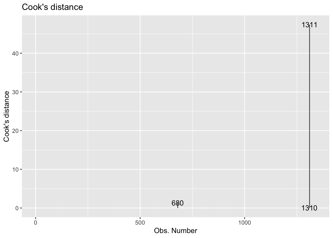
Standardized residuals, leverage, and Cook’s Distance should all be examined together. So what do we do with observations identified as outliers or leverage points?
It is OK to drop an observation based on the predictor variables if…
It is meaningful to drop the observation given the context of the problem
You intended to build a model on a smaller range of the predictor variables. You should mention this in the write up of the results and be careful to avoid extrapolation when making predictions.
It is not OK to drop an observation based on the response variable if…
- These are legitimate observations and should be in the model.
- You can try transformations or increasing the sample size by collecting more data.
So lastly, let’s analyze Cook’s D to determine if there are influential points in the data.
- Based on Cook’s D, are there any influential points in our data? Briefly explain, including any output, graphs, etc. you used to determine the response.
- If there are influential points, briefly explain why they are outliers, i.e., not in the trend of the rest of the data.
- If there are influential points, remove those points from the data and refit the model. How do the model coefficients change, if at all?
- If there are influential points, would you recommend using the model fit with or without these points for inferential conclusions and predictions? Briefly explain why or why not. Additionally, briefly explain potential impacts your choice has on inferential conclusions and/or predictions.
Team Member 4: Render the document and confirm that the changes are visible in the PDF. Then, commit (with an informative commit message) both the .qmd and PDF documents, and finally push the changes to GitHub. Make sure to commit and push all changed files so that your Git pane is empty afterwards.
Team Members 1, 2, 3: Once Team Member 4 is done rendering, committing, and pushing, confirm that the changes are visible on GitHub in your team’s lab repo. Then, in RStudio, click the Pull button in the Git pane to get the updated document. You should see the responses to Exercise 6 and 4 in your .qmd file.
Wrapping up
Important
⌨️ Team Member 2: Hands on the keyboard. Make any edits as needed.
🙅🏽 All other team members: Hands off the keyboard until otherwise instructed!
Team Member 2: Render the document and confirm that the changes are visible in the PDF. Then, commit (with an informative commit message) both the .qmd and PDF documents, and finally push the changes to GitHub. Make sure to commit and push all changed files so that your Git pane is empty afterwards.
Team Members 1, 3, 4: Once Team Member 2 is done rendering, committing, and pushing, confirm that the changes are visible on GitHub in your team’s lab repo. Then, in RStudio, click the Pull button in the Git pane to get the updated document. You should see the final version of your .qmd file.
Submission
Warning
Before you wrap up the assignment, make sure all documents are updated on your GitHub repo. We will be checking these to make sure you have been practicing how to commit and push changes.
Remember – you must turn in a PDF file to the Gradescope page before the submission deadline for full credit.
To submit your assignment:
- Select one team member to upload the team’s PDF submission to Gradescope.
- Be sure to include every team member’s name in the Gradescope submission.
- Go to http://www.gradescope.com and click Log in in the top right corner.
- Click School Credentials ➡️ Duke NetID and log in using your NetID credentials.
- Click on your STA 210 course.
- Click on the assignment, and you’ll be prompted to submit it.
- Mark the pages associated with each exercise. All of the pages of your lab should be associated with at least one question (i.e., should be “checked”). If any answer spans multiple pages, then mark all pages.
- Select the first page of your PDF submission to be associated with the “Workflow & formatting” section.
Important
There should only be one submission per team on Gradescope.
Grading
Total points available: 50 points.
| Component | Points |
|---|---|
| Ex 1 - 6 | 42 |
| Workflow & formatting | 81 |
Footnotes
The “Workflow & formatting” grade is to assess the reproducible workflow. This includes having at least 3 informative commit messages and updating the name and date in the YAML.↩︎